Responsive Bootstrap 3 Masonry Image Gallery Example
Responsive Bootstrap 3 Masonry Image Gallery:
Do you love pinterest ? Need similar template for your image galleries ?
Here we have shared masonry image gallery with responsive design using bootstrap 3 and isotope jQuery plugins.

Requirements:
1. jQuery plugin
2. Bootstrap 3 JS and CSS
3. jQuery isotope plugin


Required Imports:
<!-- jQuery js library -->
<script src="//code.jquery.com/jquery-1.11.3.min.js" type="text/javascript"></script>

<!-- Bootstrap js library -->
<script src="https://cdnjs.cloudflare.com/ajax/libs/twitter-bootstrap/3.3.4/js/bootstrap.min.js" type="text/javascript"></script>

<!-- isotope js library -->
<script src="https://cdn.jsdelivr.net/isotope/1.5.25/jquery.isotope.min.js" type="text/javascript"></script>
Custom CSS Styles:
<!-- custom css style -->
<style type="text/css">
*, *:before, *:after {box-sizing: border-box !important;}
.row {
-moz-column-width: 18em;
-webkit-column-width: 18em;
-moz-column-gap: 1em;
-webkit-column-gap:1em;

}
</style>
HTML code to display Images:
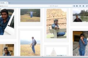
- naveen1.jpg will be displayed in the first row, first column
- naveen3.jpg will be displayed in the second row, first column
- naveen8.jpg will be displayed in the third row, first column
- naveen5.jpg will be displayed in the fourth row, first column.
<div class="row">
<div class="item">
<div class="well">
<img class="thumbnail img-responsive" src="img/naveen1.jpg"></div>
</div>
<div class="item">
<div class="well"><img class="thumbnail img-responsive" src="img/naveen3.jpg"></div>
</div>
<div class="item">
<div class="well"><img class="thumbnail img-responsive" src="img/naveen8.jpg"></div>
</div>
<div class="item">
<div class="well"><img class="thumbnail img-responsive" src="img/naveen5.jpg"></div>
</div>
</div>
Full Source code:
<!DOCTYPE html>
<html lang="en">
<head>
<meta charset="utf-8">
<meta http-equiv="X-UA-Compatible" content="IE=edge">
<meta name="viewport" content="width=device-width, initial-scale=1">
<meta name="description" content="">
<meta name="author" content="">
<title>Masonry - Bootstrap3 | Javadomain.in </title>
<!-- Bootstrap CSS -->
<link href="https://maxcdn.bootstrapcdn.com/bootstrap/3.3.4/css/bootstrap.min.css" rel="stylesheet" />
<!-- jQuery js library -->
<script src="//code.jquery.com/jquery-1.11.3.min.js" type="text/javascript"></script>
<!-- Bootstrap js library -->
<script src="https://cdnjs.cloudflare.com/ajax/libs/twitter-bootstrap/3.3.4/js/bootstrap.min.js" type="text/javascript"></script>
<!-- isotope js library -->
<script src="https://cdn.jsdelivr.net/isotope/1.5.25/jquery.isotope.min.js" type="text/javascript"></script>
<!-- custom css style -->
<style type="text/css">
*, *:before, *:after {box-sizing: border-box !important;}
.row {
-moz-column-width: 18em;
-webkit-column-width: 18em;
-moz-column-gap: 1em;
-webkit-column-gap:1em;
}
</style>
</head>
<body>
<!-- Navigation -->
<nav class="navbar" role="navigation">
<div class="container">
<!-- Brand and toggle get grouped for better mobile display -->
<div class="navbar-header">
<button type="button" class="navbar-toggle" data-toggle="collapse" data-target="#bs-example-navbar-collapse-1">
<span class="sr-only">Naveen's Images</span>
<span class="icon-bar"></span>
<span class="icon-bar"></span>
<span class="icon-bar"></span>
</button>
<a class="navbar-brand" href="#">Naveen's Images - Masonry with Bootstrap 3 Demo </a>
</div>
<!-- Collect the nav links, forms, and other content for toggling -->
<div class="collapse navbar-collapse" id="bs-example-navbar-collapse-1">
<ul class="nav navbar-nav">
<li>
<a href="#">Tutorial</a>
</li>
</ul>
</div>
<!-- /.navbar-collapse -->
</div>
<!-- /.container -->
</nav>
<!-- Page Content -->
<div class="container" style="margin-top:10px;">
<div class="col-md-12">
<div class="row">
<div class="item">
<div class="well">
<img class="thumbnail img-responsive" src="img/naveen1.jpg"></div>
</div>
<div class="item">
<div class="well"><img class="thumbnail img-responsive" src="img/naveen3.jpg"></div>
</div>
<div class="item">
<div class="well"><img class="thumbnail img-responsive" src="img/naveen8.jpg"></div>
</div>
<div class="item">
<div class="well"><img class="thumbnail img-responsive" src="img/naveen5.jpg"></div>
</div>
<div class="item">
<div class="well"> <img class="thumbnail img-responsive" src="img/naveen4.jpg"></div>
</div>
<div class="item">
<div class="well"><img class="thumbnail img-responsive" src="img/naveen19.jpg" ></div>
</div>
<div class="item">
<div class="well"><img class="thumbnail img-responsive" src="img/naveen12.jpg"></div>
</div>
<div class="item">
<div class="well"><img class="thumbnail img-responsive" src="img/naveen6.jpg" title="Can you believe it??"></div>
</div>
<div class="item">
<div class="well"><img class="thumbnail img-responsive" src="img/naveen17.jpg"></div>
</div>
<div class="item">
<div class="well"><img class="thumbnail img-responsive" src="img/naveen13.jpg"></div>
</div>
<div class="item">
<div class="well"><img class="thumbnail img-responsive" src="img/naveen2.jpg"></div>
</div>
<div class="item">
<div class="well"><img class="thumbnail img-responsive" src="img/naveen18.jpg"></div>
</div>
</div>
</div>
</div>
<hr>
<!-- Footer -->
<footer>
<div class="row">
<div class="col-lg-12">
<p>Copyright © yourcompany 2015</p>
</div>
</div>
</footer>
</div>
<!-- /.container -->
</body>
</html>
Note:
- Full source codes shared above is the only required file here, you can copy paste it and change only the image names.
- If you do not want to change the image names also, then download the zip file and directly check the output.